“Does it feel like the elements in the painting’s composition belong together, or are they separate bits that just happen to be in the same painting?”- (Marion Boddy-Evans)
Composition plays a vital role in graphic design. It gives a sense of structure and helps the viewer easily navigate the design layout. It is a step graphic designers swear by as it shows that focus is an essential thing as designs need to use in graphic design to make sure their content is arranged nicely. It is to ensure each element in the design compliments each other than all looking separated.
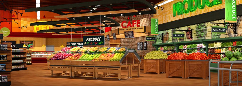
A good example of composition would be this portfolio design. The Maxi foods company wanted to provide a visual display which will make all the products displayed for desirable for the spectator. The owner of maxi food stated his objective was “I want to provide a feel that Australian supermarkets have not had before”. This strategy worked as retail theme is modern yet welcoming that attracts most people of the target audience, this corresponds with the founder’s aim. The retail is bursting with colour which conveys an emotion of style and happiness since humans are naturally attracted to brighter areas in our field of vision. Also, by having a physically pleasing style in interior would naturally influence the customer to shop at their location. I admire how the shorter, wider tables are placed at the front whilst placing the lean, taller shelves at the back because it gives an impression of less visual clutter as the table display is the first thing the customers would see then secondly the background shelves. The interior designer would need to understand the customers behaviour when placing the presentation spaces and where the flow of traffic would be.
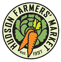
This logo design is from a website for an event called the Indoor Farmer’s market which is located at Christ Church. To celebrate the 15 year anniversary the Hudson Farmers’ market will hold a total of 32 vendors providing a wide range of locally grown organic and non-organic food such as meat ,seafood ,milk bread eggs and other items such as crafted items and flowers.
Despite the logo having a good use of line and colour the background layout in the centre looks over complicated and visually cluttering for the viewer. If I was to change the design I would make it more minimalistic. The main elements my vision draws to firstly is the background then the two carrots in the centre so I would begin by redesigning the background to captivate the viewer.
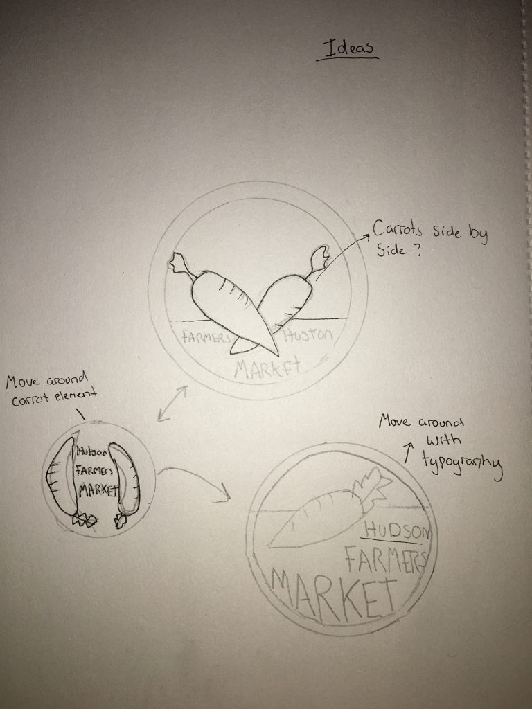
These sketches shown how I have tried changing the format from the original logo design but I still kept the border design and the carrot.
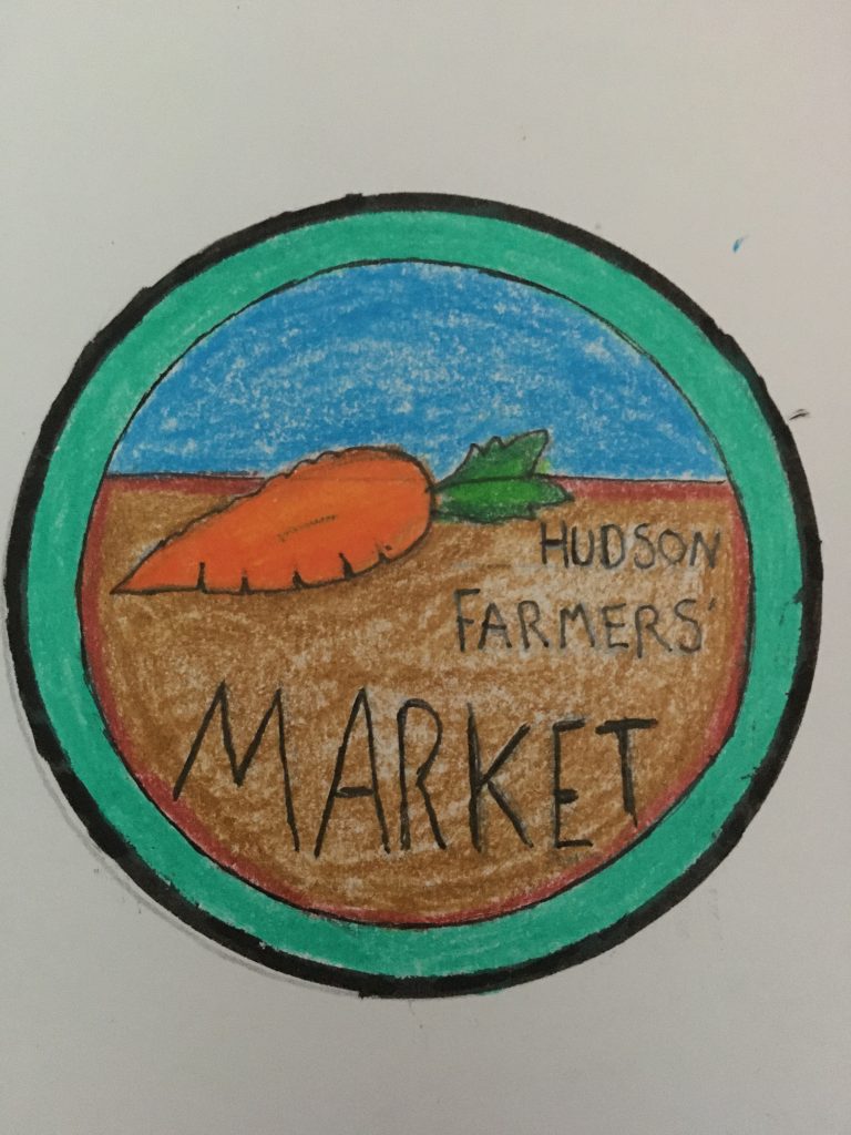
I have created my final design piece, I decided to play around with the layout to make the design look less complicated and used colour to make my drawing look more attractive. I decided to draw in only one carrot to not overcomplicate the imagery.
http://www.art-quotes.com/getquotes.php?catid=52#.YX-1YmDP1PZ – Quote
