“Eating healthy food fills your body with energy and nutrients. Imagine yours cells smiling back at you and saying: “Thank you!”- Karen Salmansohn. https://www.notsalmon.com/2015/07/21/lose-weight-fast/
Eating healthily is so vital to us because it is an important part of maintaining good health which makes us feel at our best. It improves us mentally, physically, and socially hence the saying ‘You are what you eat’. Eating healthy has so many benefits to the human body such as it can help us have a better mood may help you live longer and gives us more energy to enjoy life. Since an unhealthy diet and a lack of physical are leading global risks to health nowadays it is needed for people to be aware of these risks and to take action and prevent these actions from happening.
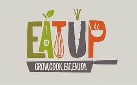
Typography has an essential role when it comes to healthy eating designs. A good use of line, colour and shape would help strengthen the design which would be aesthetically pleasing for the viewer. This is an example that I have found that uses design and typography nicely. The image depicts the words ‘Eat up, grow, cook, eat, enjoy.’ It also included conceptual imagery as they used negative space to create simple imagery or fruit, vegetables, and cooking utensils. Underneath the typography has a smaller slogan underneath which is meant to resemble a frying pan. The font of the typography is in sans-serif and are all upper case that makes the font more legible. The font also appears to have uneven lines just like if somebody has drawn the typography by hand which gives a more youthful appearance. The colours used for the poster consists of green, orange and grey. The colour green is a good choice of colour as it is looked up upon as growth, health, safety, and environment. The colour of orange indicates joy and enthusiasm. Both colours are opposite on the colour wheel which make the design bolder and eye catching.
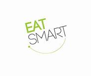
A a poor use of typography of healthy eating would be this example. The slogan ‘Eat smart’ has upper case letters to appear bolder and more readable. I think this design is rather boring as there is no creative aspects within this piece apart from one use of the colour green. There appears to be a curved line underneath the typography which represents a smile, but the line is too small to tell. If I could improve the design, I would add more elements of healthy eating imagery and make it more interesting to look at as this current design is far too plain. Adding a new, bolder font would help liven the whole design up also.
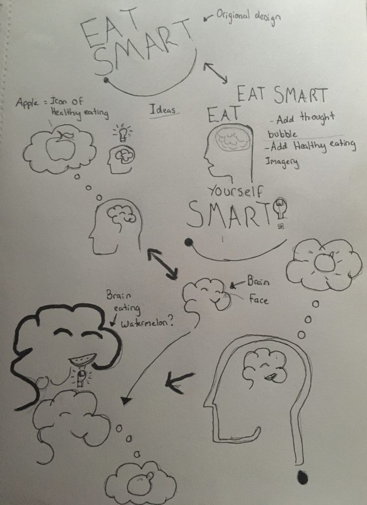
For these ideas I wanted to note down some ideas then merge these notes into a logo. My idea at first was to design a 2D face with a brain to represent the ‘eat smart’ aspect however I wanted a design that is simple yet fun to look at. I wanted to different ideas than sticking with the original ‘Eat smart’ logo.
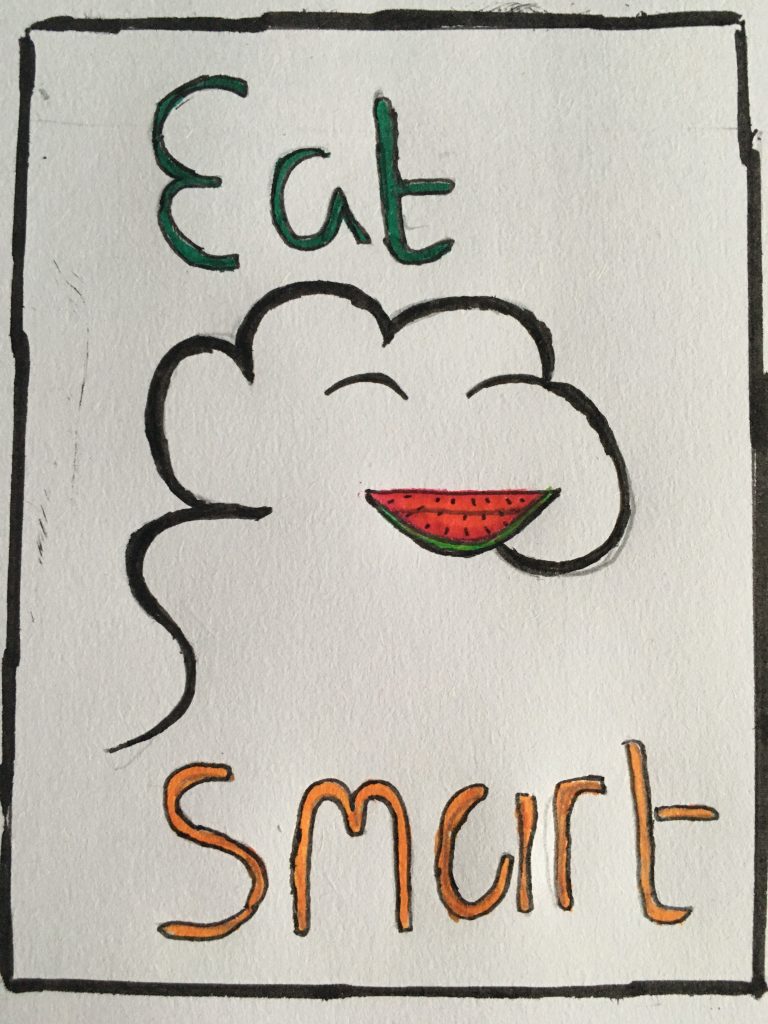
I have completed a sketch of my final design logo, I went conceptual imagery to get people thinking. I have kept the original sketch design however refined it. I wanted to base the logo idea on the word ‘smart’ so I drew an abstract brain. I wanted the design to resemble a brain but also I added a face within the imagery to give it a character to visually imply to viewer that eating healthily is a good choice. Next I added a watermelon in the design to add the healthy eating aspect and to create a smile at the same time to show the good of eating healthily. I would have gone for the standard apple element but I thought it was overused an common as other logos heavily use the apple imagery to indicate the ‘healthy’ factor so I wanted to use something else to represent the healthy eating. I used fine liner and coloured pencils to create this logo. Using fine liner I wanted to broaden out the brain design to make it the focus of the drawing and to make it clear for the viewer. Pencils were then later used to add some colour as I wanted this sketch to be kept simple.
