What you see depends on how you view the world. To most people, this is just dirt. To a farmer, its potential” – Doe Zantamata
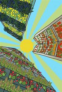
For this week I have been asked to find examples of urban farming designs, from there I had to explain how the use of colour makes the design stand out and what needs to be refined. I think urban farming is important because it is a way to keep green space in populated places and to allow people to grow nutritious food at their convenience whist educating people about urban agriculture. Growing crops at the consumers reach would also allow a sense of community, which will allow people to have a better mood and a better mindset towards gardening.
I think this design is a good example of urban farming, it depicts a first-person viewpoint of three tall building structures with a wide range of produce directly placed on the buildings. It then shows a 2D sun. what I like about this design is the use of colour as the pallet for this illustration uses bright, lively colours to portray the benefits of growing crops in urban spaces. The colours used are mostly primary colours. Some colours are shown to have slight gradients to shift focus and to make the illustration less flat. I also like how the darker, silver shade on the skyscraper’s contrasts to the sea of greens, reds, yellows, and blues. What I find particularly most interesting is the viewpoint the designer chose as its meant to be if someone is looking directly looking up to the sky. The sun is placed towards the middle and the three buildings are surrounding the sun which naturally draws you to the centre of the design.
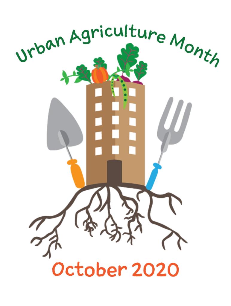
this design was for an upcoming urban agriculture month event. I don’t think this design is particularly bad but it can be improved. I think the background is plain compared to the other urban farming poster examples I have found. To make this poster more interesting I would add a background colour and play around with the layout.
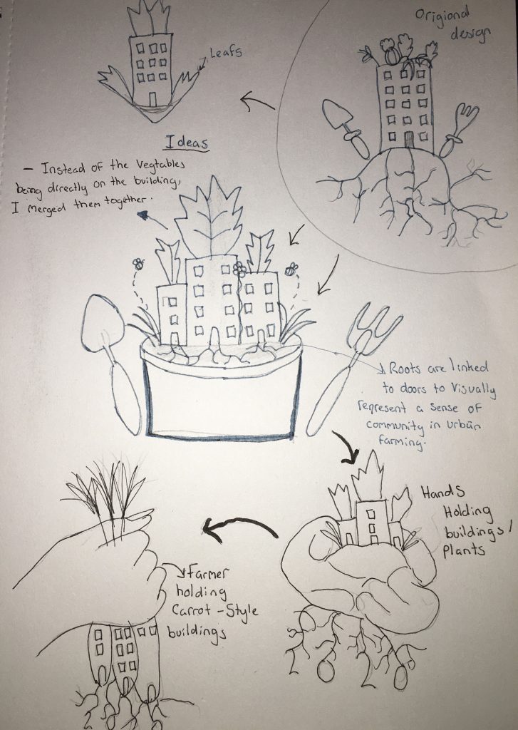
I have created some basic sketches to find ideas for a design. At the beginning I at first thought about the idea of making the landscape the plant pot and the buildings the plant but I thought the design would be overcomplicating the original design so I drew similar options. I opted to a simpler design by combining the vegetables and the buildings together. I designed hands and added two other vegetables to give a sense of community and to give it a home grown feel, this design is better as it makes my design look 3D and adds depth.
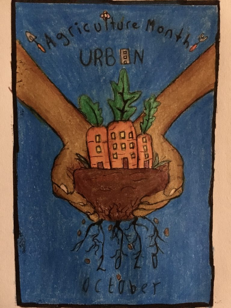
I have completed my final design with colour. I decided to keep some of the original elements such as the roots, typography and the gardening tools. I didn’t add too much detail to the typography as I wanted the focus to be the centre of the drawing. Using fine liner and coloured pencils I wanted the colour to brighten and attract attention to the viewers. To make the imagery look three-dimensional I layered lighter and darker shades of coloured pencil to highlight the hands and the plants and darkened areas of the image I didn’t want highlighting. I tried making the ‘2020’ date look like its a part of the root’s stems. The background is blue as the other colours used are mostly closely linked in the colour wheel so I can create contrast.
Quote- https://www.quotemaster.org/urban+farming
