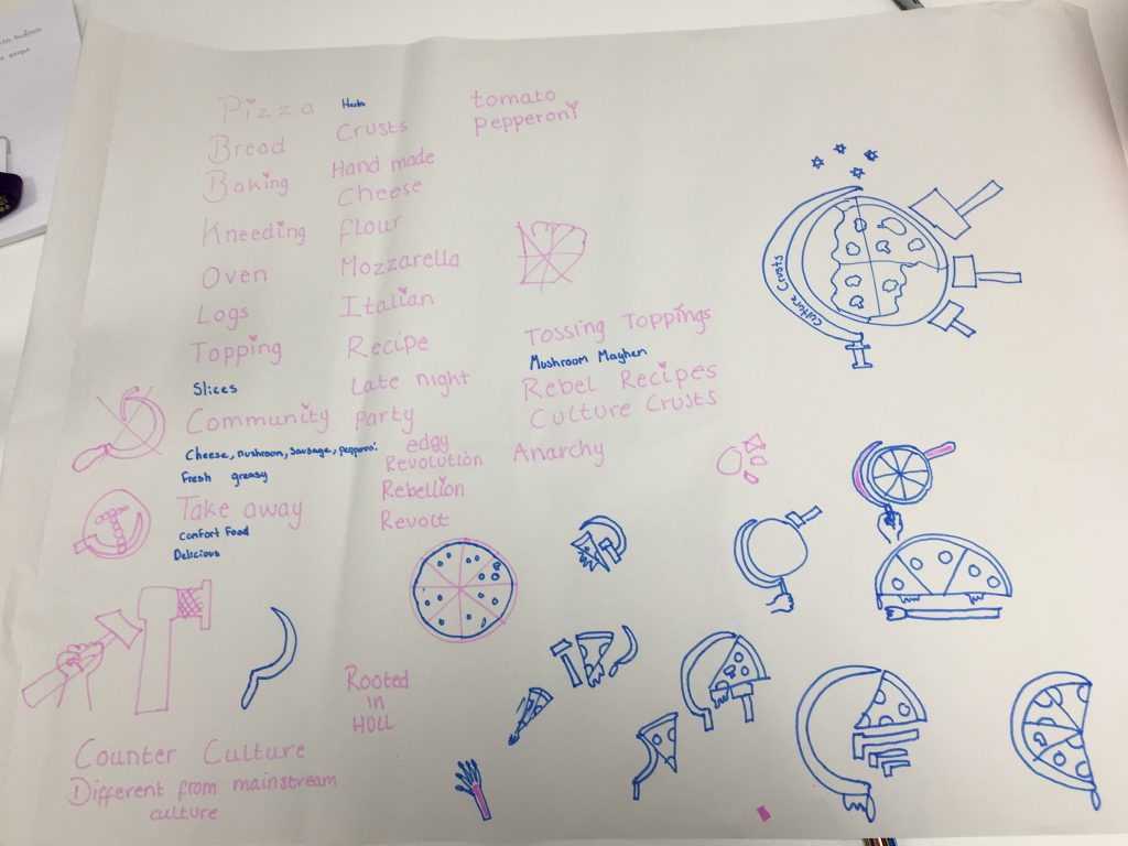
For this lesson Robert had an unexpected email from Adrian Fisher asking us graphic design students to design a pizza logo for a young man who started baking pizza in Rooted’s bakery. ideally he desires to have some variation of the hammer and sickle for a sense of community and food to look ‘underground’, ‘for the people’ whilst keeping it ‘edgy’. The design also has to have some resemblance with the Rooted in Hull logo as the bakery is on their site.
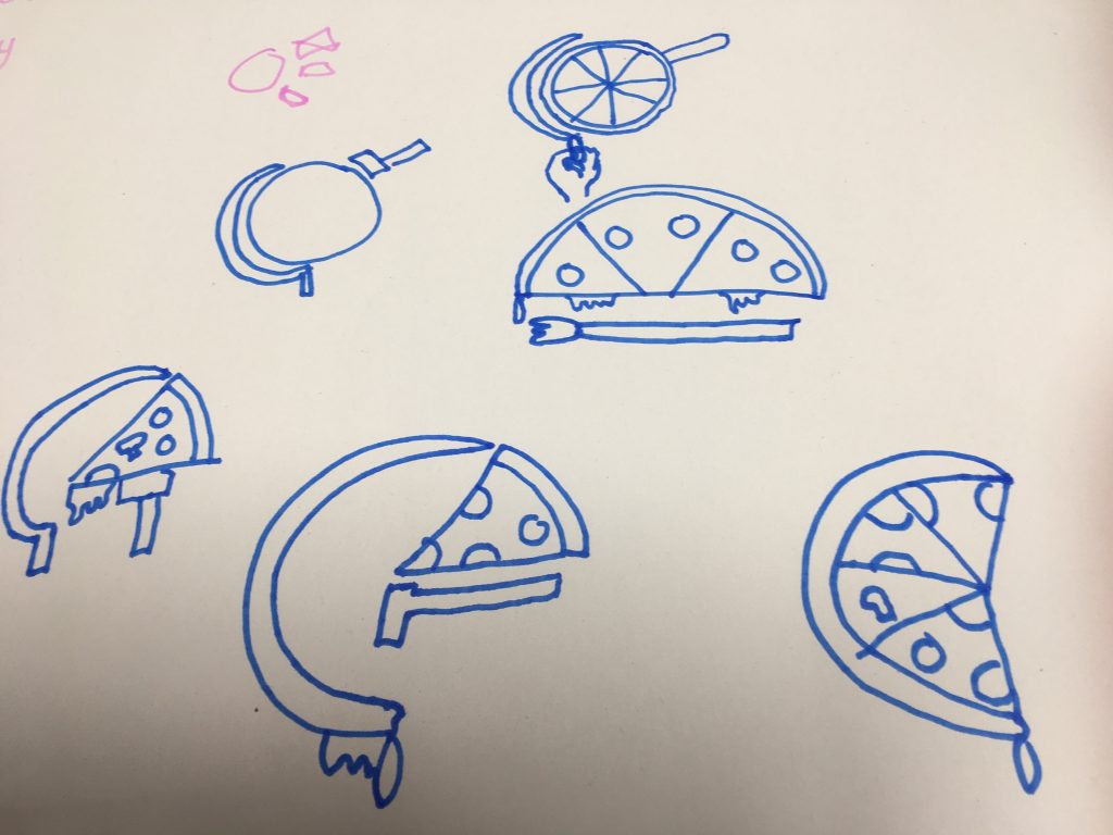
Working in pairs we come up with designs for a potential logo. We began by incorporating the hammer and sickle imagery. I thought I could experiment with shape combining the sickle and the pizza together to create a conceptual design.
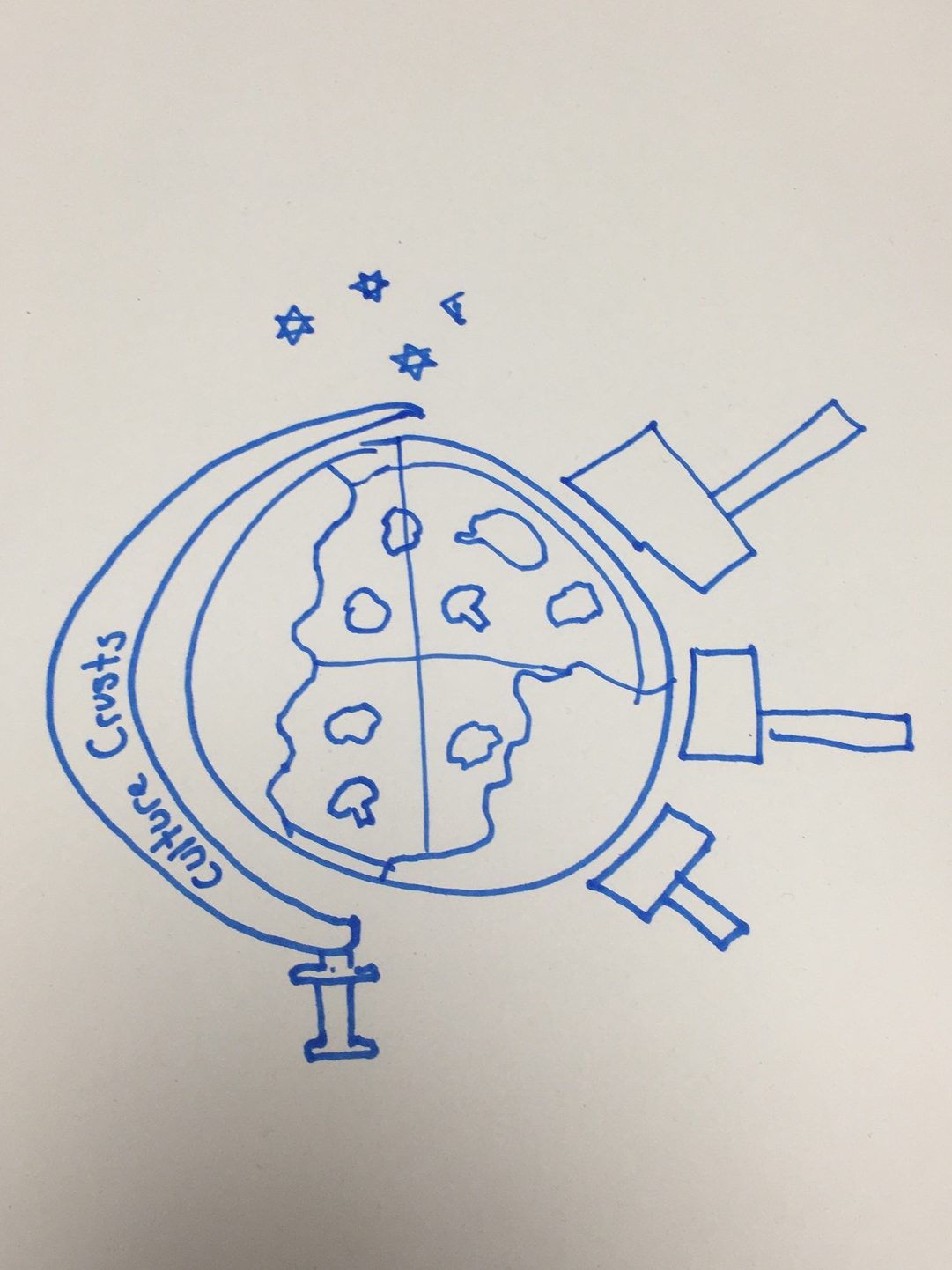
Our idea we came up with would be this pizza logo. We came up with the name “Culture Crusts” as the name sounds catchy and memorable. The main idea for the design would be having the pizza as the globe to add the ‘culture’ element to it. We decided to add three hammers into the logo to make it the same layout as Rooted’s logo. Adding the sickle around the pizza also makes it look like an ornamental globe which I liked. Stars are also added into the design because it is a symbol used in the original communist logo. Although we came up with a good idea for a design I believe it could be improved more like neatening up the design or placing the typography outside the sickle to make the logo name stand out.
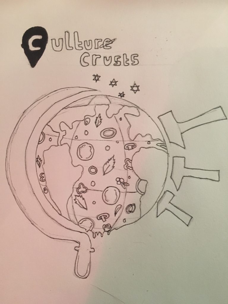
Taking inspiration from my previous sketch I drew a detailed version of how I wanted my logo to look like. It is the same concept of the old sketch but more refined.
To improve this piece I am going to go on illustrator and adapt my ideas further like adding detail to the pizza toppings and play around with the typography.
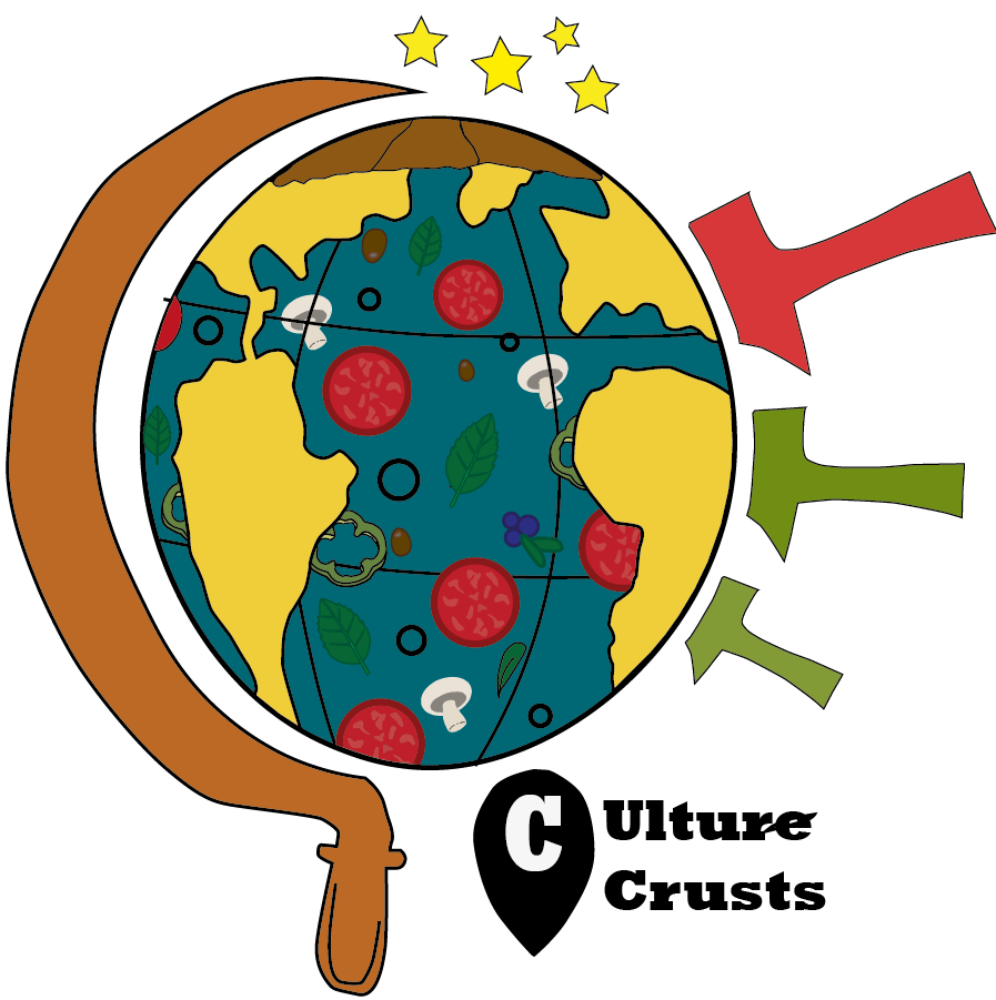
I have created an illustrated version of my pizza logo For Rooted in Hull. Unlike the sketch I’ve done earlier, this pizza logo is more detailed and has colour. I wanted to make the pizza logo similar to my sketch but more polished.
Pizza design idea 2
For this upcoming design, I am designing another pizza logo of my choice. My original concepts would of been a cartoon-ish theme again however I wanted to choose a simplified idea by making this logo Two-dimensional and toning down the colours. I wanted to create something different to my other pizza design to explore different designs I can do.
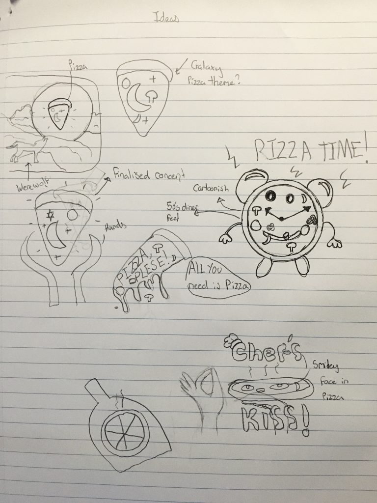
I have then finalised a second idea for a logo with this mainly black and white design basing it on my sketches i have done previously. I came up with the logo name ‘Moonlight Munchies’ as it sounds to be a catchy, fitting name for this design.
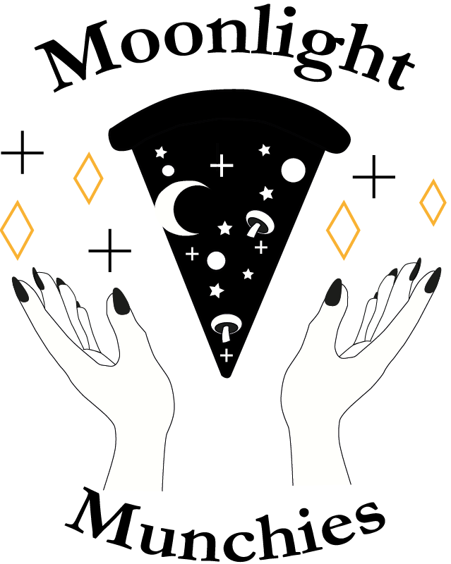
In this design there is a silhouette in the shape of a pizza slice which is meant to mimic the night sky. also, there are hands in a cupping shape which i have used pen tool for and based it from reference on my own hands to compliment this design furthermore. I have went with a more grown- up theme for a pizza logo so I can have variety on what I have created which is why I went for a more ‘edgy’ theme to it. I have added one use of colour for the stars on the outer skirts of the design for the stars to give some colour to this muted design. The typography used is ‘Garamond Bold’ with the typography in a large font to give a clear finish to the logo design. Choosing this font is a good choice for me as it adds to the edgy appearance since its a gothic font. I then added a warp text to give the design a circular appearance to it.
