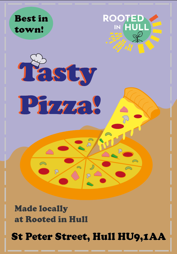
I have created an A5 flyer for Rooted In Hull to advertise the pizza they create and to promote and spread awareness for the potential visitors this would be given to so I tried making the design appealing for the viewer to look at whilst also giving information of the upcoming pizza nights they host.
On illustrator the font I used for this design is called ‘Cooper Black’ I thought this font would be a fun yet professional font to work with. I have used spacing with the typography as it has to be legible for all viewers included which is why I also enlarged the font to make it more readable from afar. The use of a dark colour is added to the location of the leaflet to add more visibility so people do not forget its location. Furthermore, I have added the Rooted logo to promote recognition of the brand as well.
The imagery I have created is of a pizza in the centre of the leaflet with a pizza in mid-air with cheese falling down beneath it. I wanted to base this pizza of the one I tried at the field trip of Rooted In Hull to get to the viewers an idea of what they will receive at the pizza events so I made it look appetising. I wanted to focus the attention on the singular pizza slice rather on the full pizza below by making it lighter and more detailed. I wanted to make the theme cartoon-ish so its fun to look to invite people of all ages to be invited. For the background theme I opted for a more creative background whilst trying not to over complicate it too much so I decided to do a soft Zig-zag pattern behind the pizza to make it more three-dimensional. The colours used for this design are similar and inspired by Rooted’s colour palette. I went more a Pale, baby blue colour with a very light brown in the background as they both contrast perfectly. Also, I have added a stich-like frame in the background to give it a home- grown look feel to it also to represent that everything Rooted has to offer is home made.
