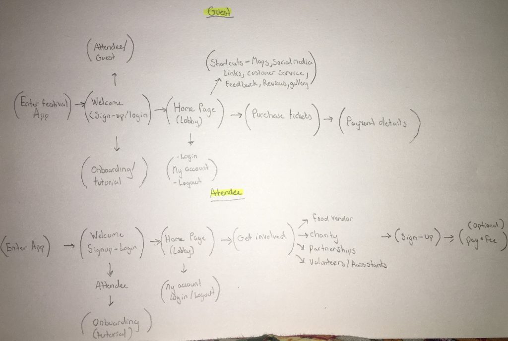
Here is the start of my prototype planning, listing down the options that are going to be added in my prototype I have added the basic needs every festival app should acquire by listing the app process in order as a volunteer or a guest that wants to attend the event. The aim of the prototype app would for them to purchase, find out information on where and what time the event is scheduled, social media links, information of the activities being held, post event updates and social proof with testimonials. I have looked up different music event websites to further expand research as to what my prototype app must include. The app design must be co-operative and seamless so the app can have changes and shift between devices to make it more fitting such as transactions.
As for the volunteers and vendors the app will guide them through applying and paying to set up a food truck or charity stall with ease. The potential volunteer will be given information on such tasks need to be carried out such as supervision or cleaners and an option

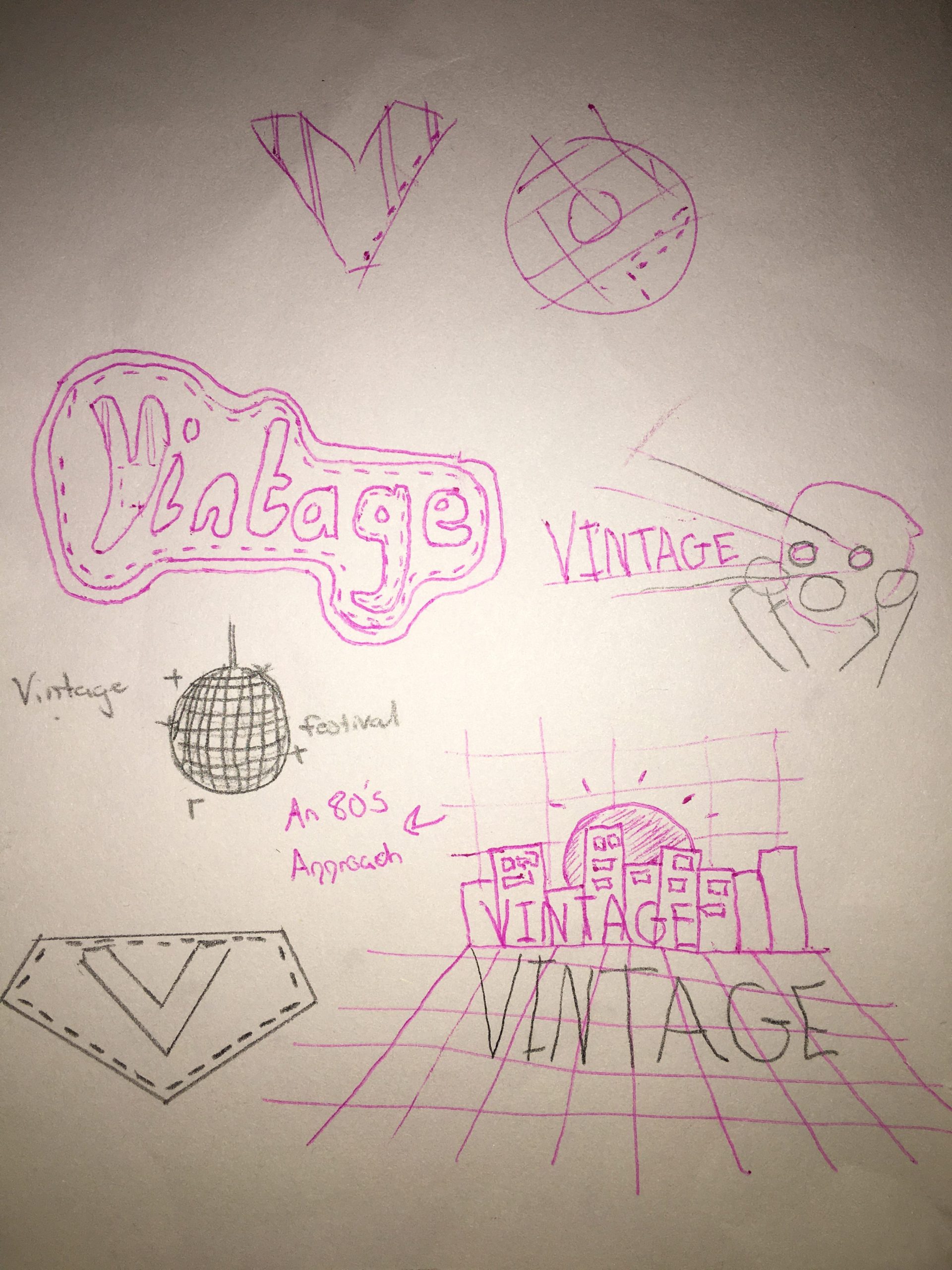
A key element to my project would be a logo to represent what my app stands for. I came up with really rough sketches to show what options i can create for my logo. I began with designing a stereotypical 1980’s approach to capture the first thing that I would associate when thinking of the word ‘vintage’. I originally wanted a landscape themed logo however I believe the logo should be simple as simplicity would make my logo more recognisable and memorable. I then had thoughts of creating a sci-fi themed logo that would be reminiscent of the 1980’s period but I decided that when I think of vintage, I think of the fashion that was brought in this area. I took inspiration with an embroidery patch design but then I have simplified it with a denim and stitching approach which made my logo look more 3D and straight to the point on what many people would believe vintage is associated with.

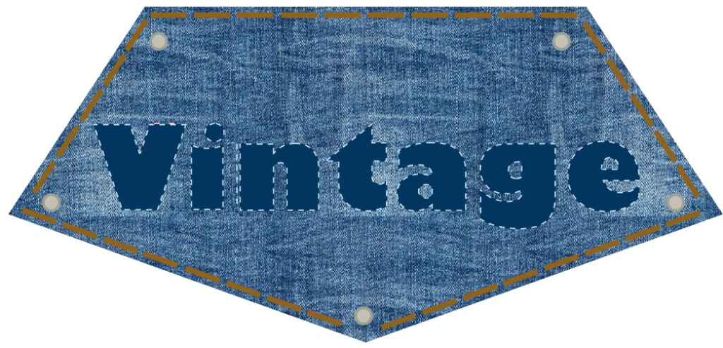
Here is the final outcome of my logo, I have made a few changes but kept it similar to my previous sketches. I came up with the idea of adding denim to the background shape instead of the font as it would make my logo more legible, not to mention it resembles a piece of denim clothing like a jean pocket. Using illustrator I have added a stitching effect with a light colour around the font to make it stand out and i have also added a stitching effect on the outer skirts of the shape to give a hand-made look to it.
