(Due to my late enrolment I had to complete my development log series independently)
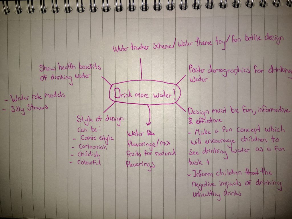
Although not being absent to complete the majority of the development log tasks for this project for this weeks task I had to come up with my own idea on how to create a fun design concept to encourage children to drink more water to promote less sugary drink consumption. I can accomplish this by creating posters, toys and stickers to create my interpretation for this weeks concept. I will be using Photoshop and Adobe Illustrator with some sketches during the beginning stages of designing a concept. Before I decided to create a concept for this weeks project I have began brainstorming ideas with planning ideas on the possibilities I can include to make my outcomes more achievable. Since I had to work myself for this project I had to think outside the box of all the possibilities I can make.
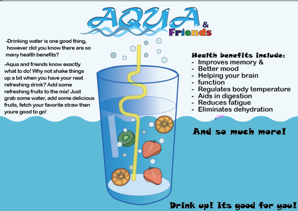
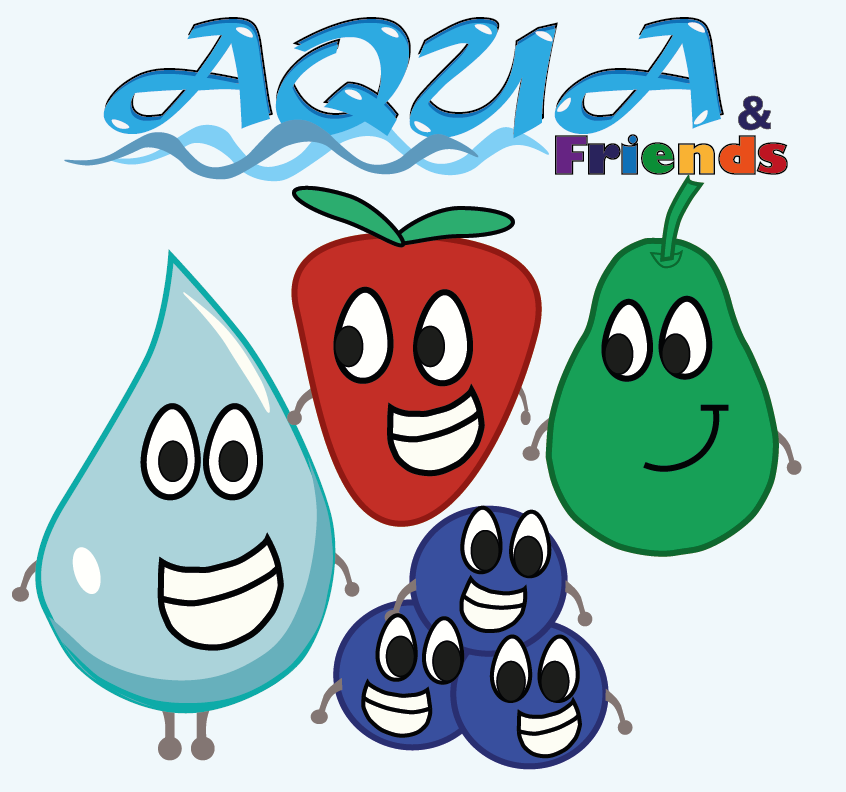
For my first outcome I have decided to create a poster & A mascot logo to advertise making the experience of drinking water fun for children. I have made created this franchise called ‘Aqua & Friends’ with the concept being the ‘Aqua’ being the main logo and ‘Friends referring the the fruit mascots. I have firstly began with the concept of making the whole experience of drinking water fun by making a factual poster and childish mascots children would be able to remember. The way this concept makes children encouraged to drink water is to improve the quality of taste by allowing fresh fruit to be added and also allows children to also eat fruits alongside with water.
For the design choices for my poster I have went for a landscape poster on adobe illustrator to create a poster where children can view a detailed image of a glass of water with bubbles, fruits and a fun straw to make the design the focal point. I tried making the drink look as appealing as possible to reach out to the audience to make drinking look as fun to allow them to imagine the drink being cool & refreshing. I have added the Aqua & Friends logo on the very top of the page to advertise the franchise being almost the first thing the audience can see. I picked a simplistic background of a similar colour scheme of light blue & blue so it doesn’t overcomplicate the whole look I tried to make sure the design doesn’t blend in with each other too much so have added hints of contrasting colours such as red, orange, green & yellow to further enhance my design to draw more attention to those colours. As for the font and the overall design of the logo I picked a font that i would associate with water, so a waved font choice is chosen. I have also further accentuated this by adding waves. Fruits are colourful by nature so for the ‘Friends’ part of the logo I made the colour scheme rainbow. As for the mascots I have picked simple fruit characters that all align as a squad to promote the idea of hydration and eating healthier.


