What are visually responsive designs?
Visually responsive website designs are the use of adjusting the website sizes are automatically adjusted to scale the contents on the website based on the device chosen when viewed. Apps need to have a good visually responsive layout so the same composure & structure of the website can be accessed on different websites so it can be viewed to a larger audience. The reason as to why web designs are visually responsive is so it can reduce the finance of making secondary websites for that specific device so many designers choose to improve the way their design looks on website 1as the cost is cheaper. Having a visually responsive layout gives higher rankings and makes finding your website easier. The key to a good web design page is to make sure the web page layout looks good on all platforms used.
Example 1- YouTube
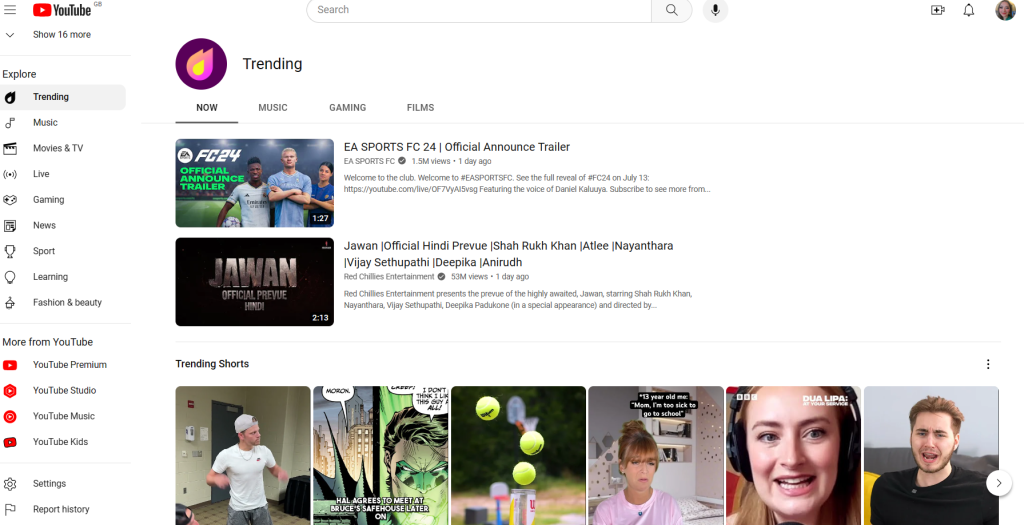
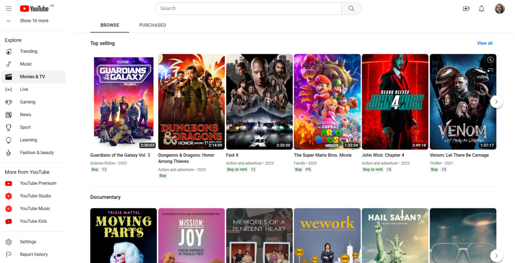
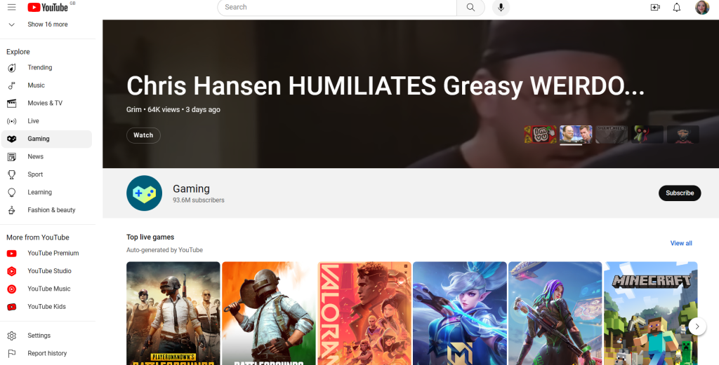
Probably the first website that comes to mind of visually responsive designs would be YouTube. YouTube is a great example as it is a staple app every device has and it is clear as to why this is done. Whether you’re viewing through TV, phone, tablet, computer or gaming console YouTube’s content has always had been successful as it is used by everyone. YouTube has also now added larger thumbnails to visually declutter their home screen to display the most relevant subscriptions.
Example 2- ASOS
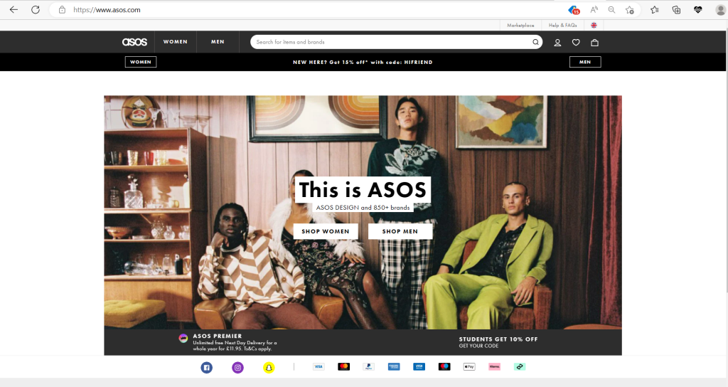
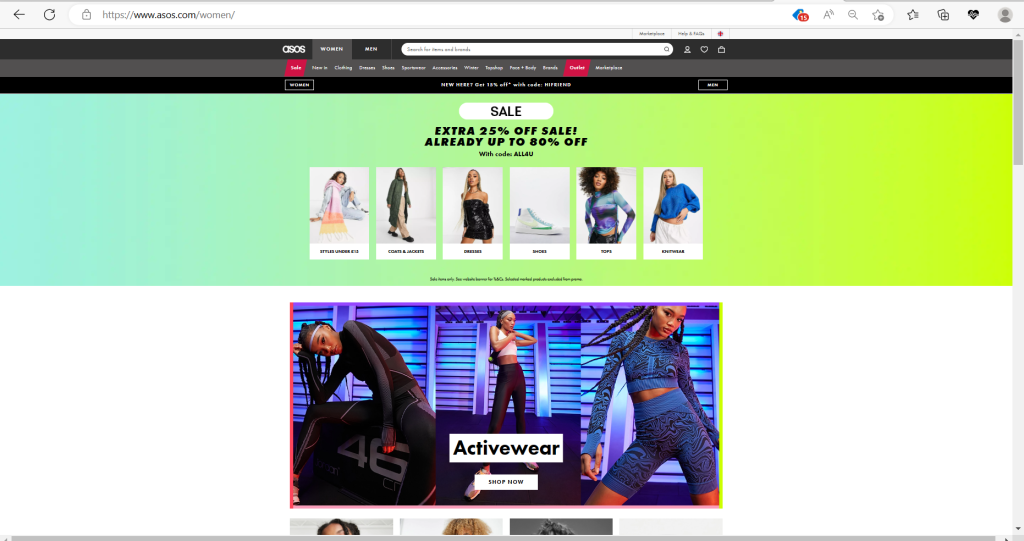
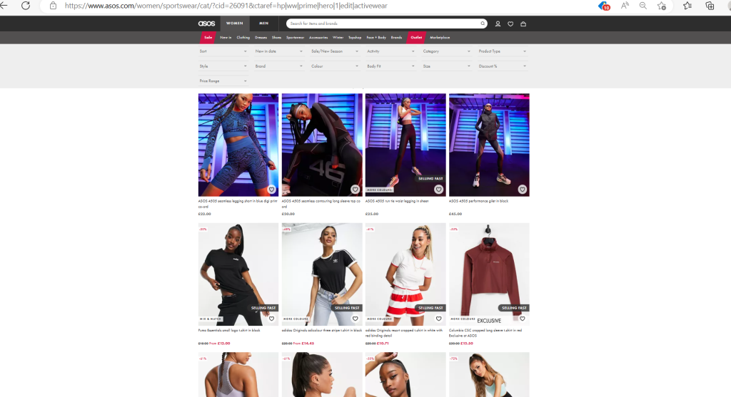
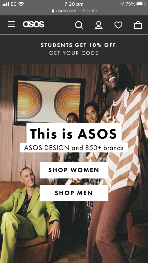
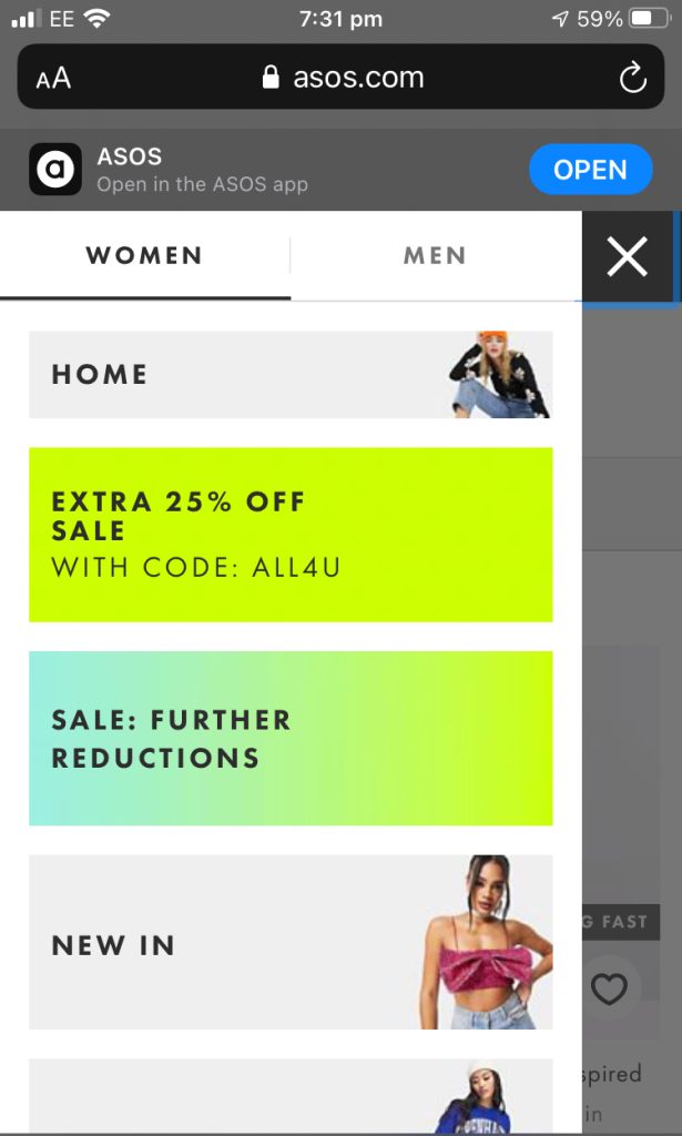
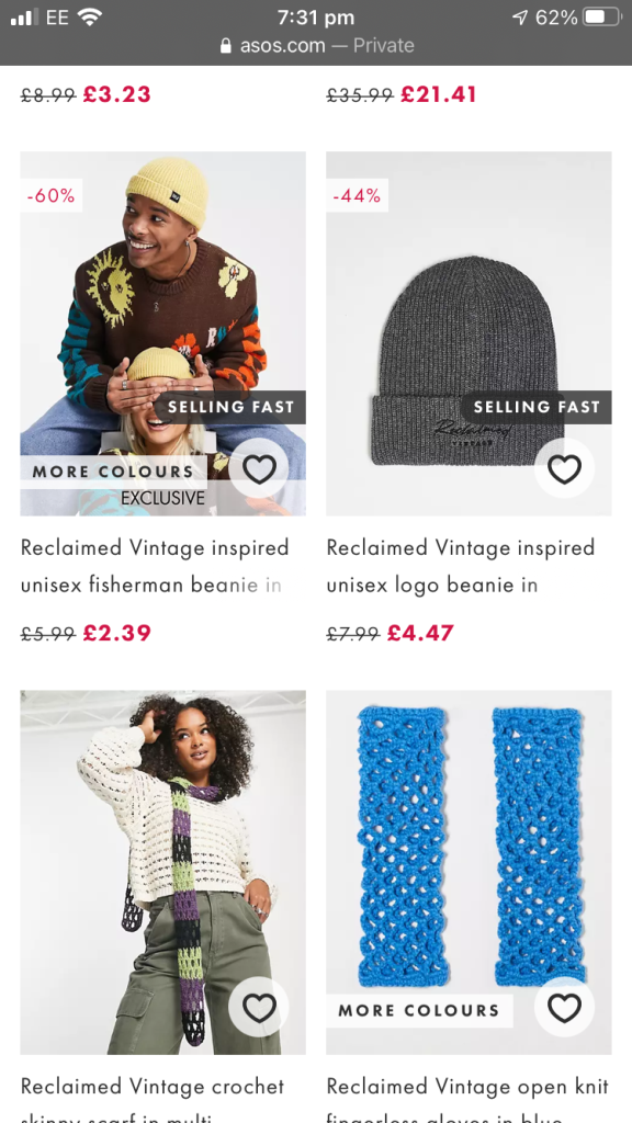
ASOS is a popular online clothing, accessories & lifestyle store like no other, it provides good quality fashion that people from all ages can take part in. Whether the budget is expensive or cheap there is bound to have something for everyone. When first viewing the app on computer. What I like about ASOS is it arranges all their products in categories to make it convenient and less confusing.
Example 3- H&M
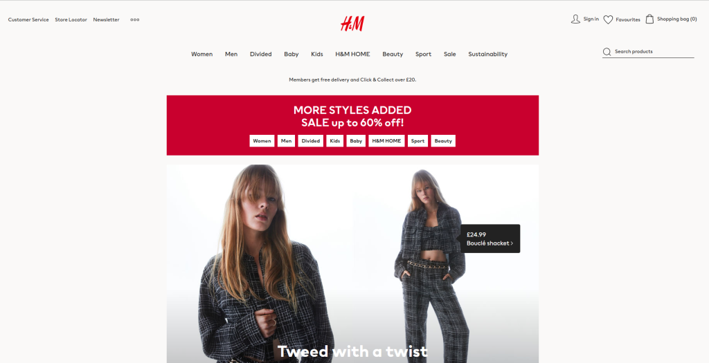
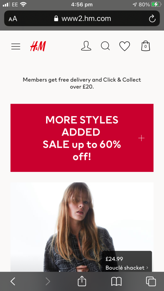
Image 10 – H&M home page 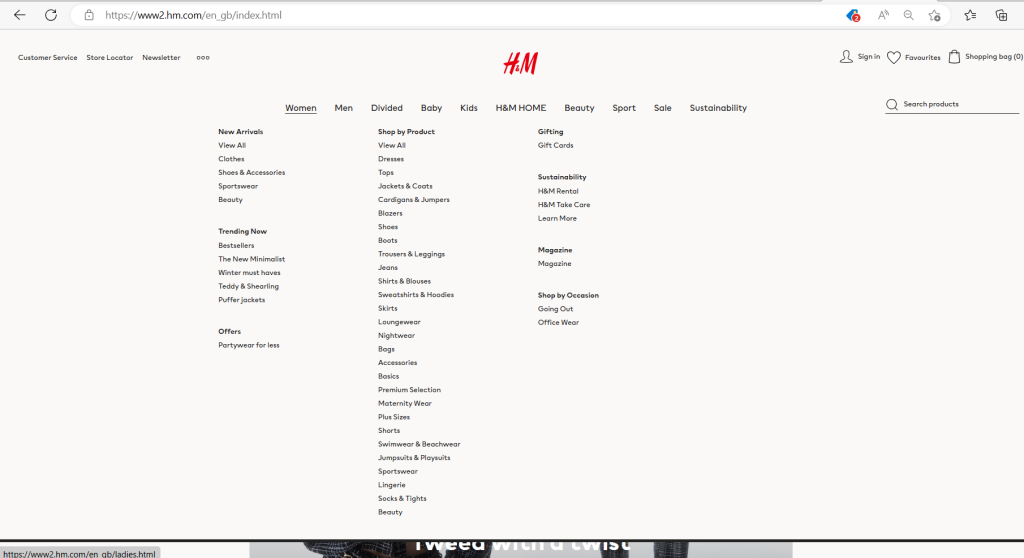
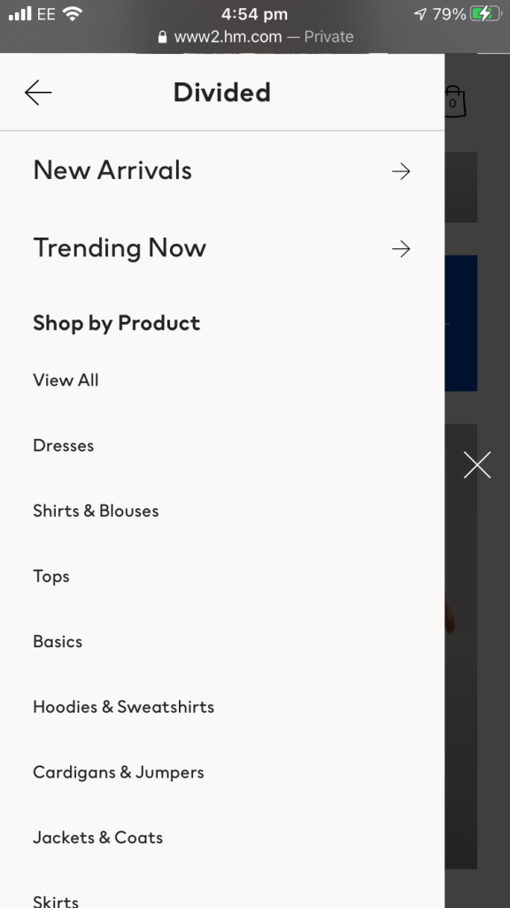
Image 11- All categories on H&M 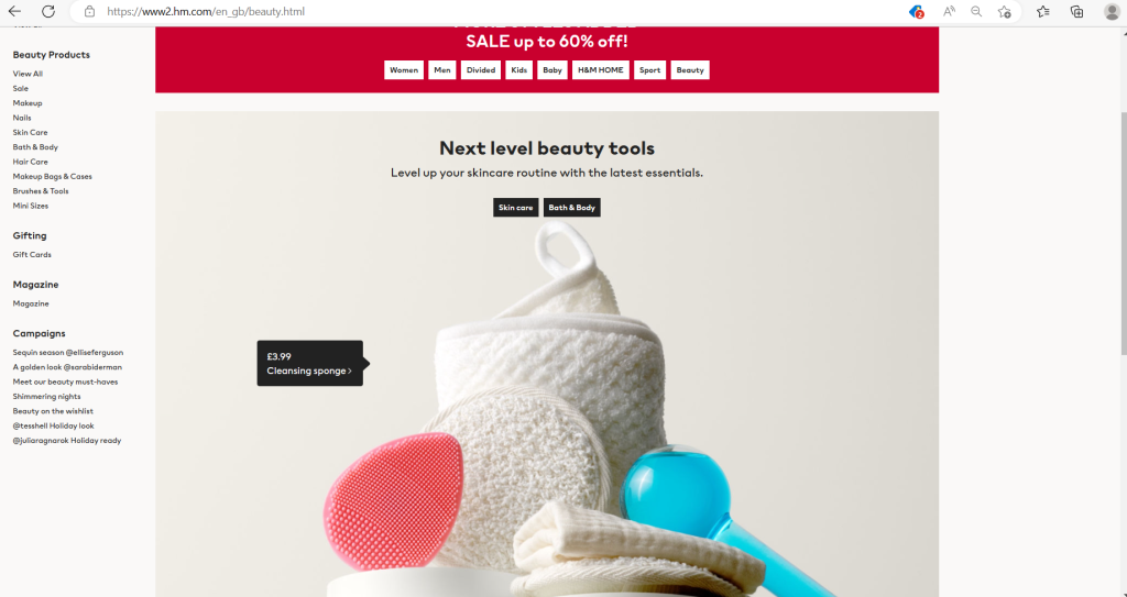
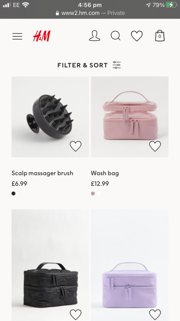
Image 12- Beauty section 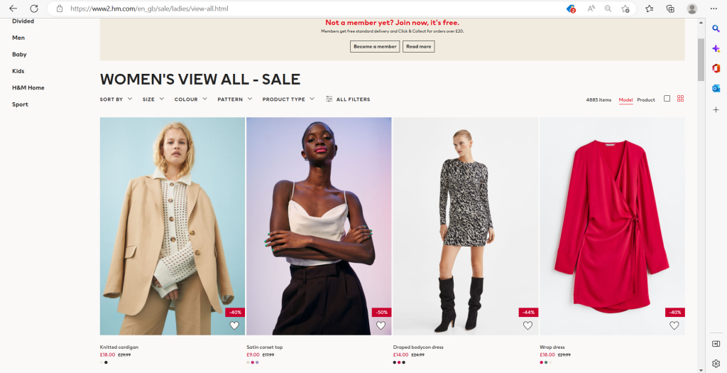
Image 13 – Womens clothing collection 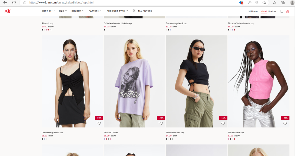
Image 14 – Clearance collection 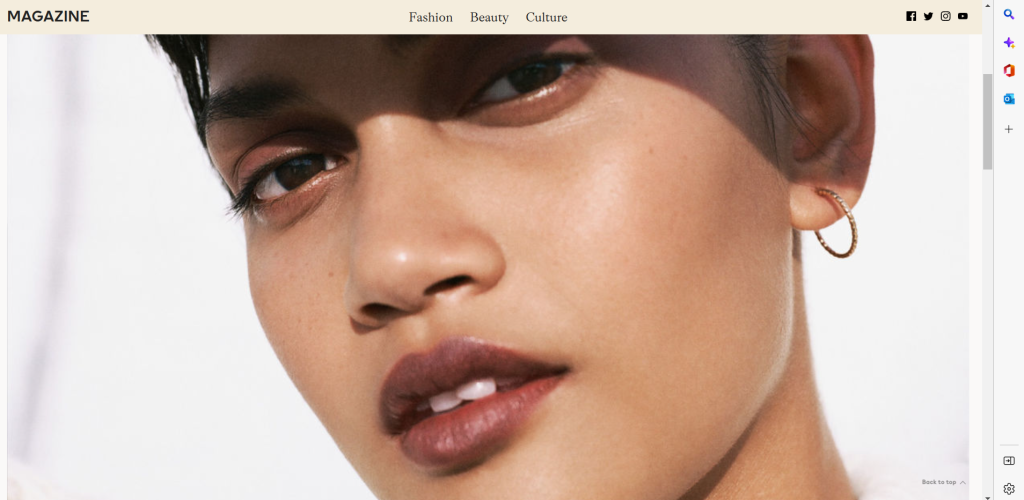
Image 15- Magazine/blogs
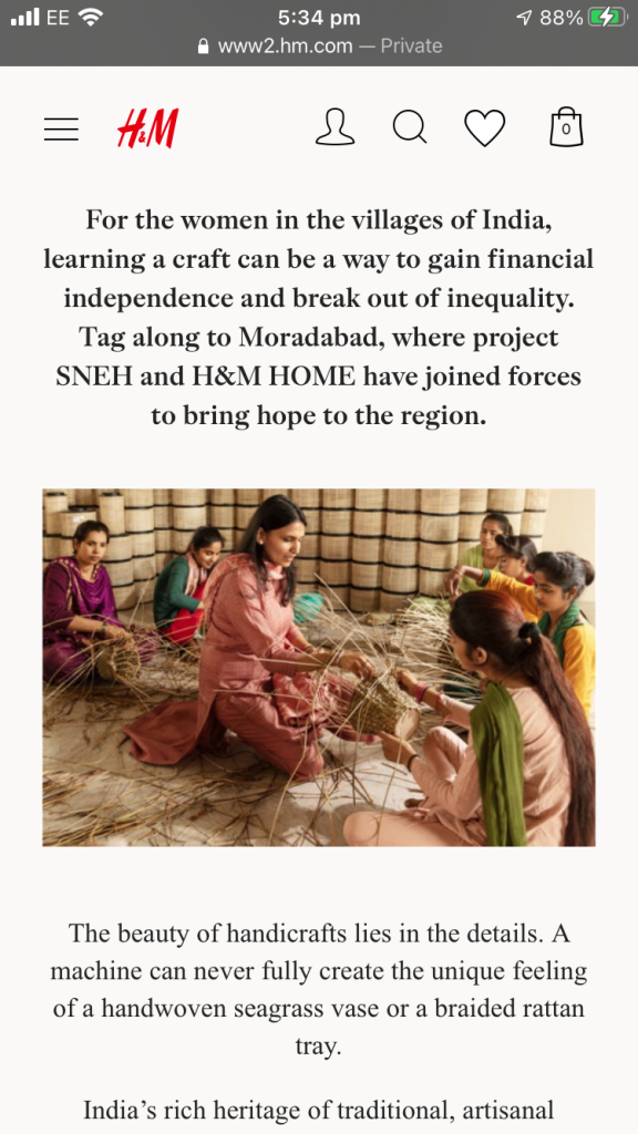
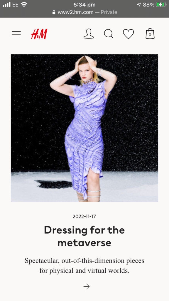
Another example of a visually responsive design is H&M, just like ASOS H&M follows the same pursuit. H&M is a fast-fashion clothing website that has multiple retail stores all over the UK targeting specifically teens & young adults. The website itself is for purchasing inventory online. On the computer screen the web layout shows large imaged all in gridded format, they have primarily used big images for the main screen categories/home screen to show a large example of what they are selling or the best deal that is currently on trend. The page layout has all the content/typography placed in the middle of the webpage and the categories can be placed towards the left side for the viewer to engage in the next part of their browsing.
The only downside to the computer version is how tiny the font used is, Although the typography is compressed to have all categories on one menu it could be a problem to many people not being able to read, for example viewers might have to zoom in or use glasses to read to contents on the screen.
On the iOS mobile version of the website is more compressed which makes the layout look better in my opinion. Unlike the website version the app version has a hamburger menu, to display all shortcuts to each department in which the viewer chooses, this is done so it is easier to navigate all items. The gridded format to display products make the website aesthetically pleasing. with 4 items that can be seen within each screen this encourages the viewer to take a closer look at each product and gives the effect that the website is minimalistic, with all products being spaced out this makes the viewer want to continually scroll down.
Gotter, A. (2020). The New YouTube Layout and What This Means for Your Channel. [online] Snappa Blog. Available at: https://snappa.com/blog/new-youtube-layout/#:~:text=What%20These%20Changes%20Mean%20for%20Businesses%20%26%20How [Accessed 5 Dec. 2022].
Mobile App Daily (n.d.). ASOS App- Unique Shopping Experience on a Budget. [online] MobileAppAaily. Available at: https://www.mobileappdaily.com/product-review/asos-app#:~:text=Features%20of%20the%20ASOS%20app%201%201.%20Easy [Accessed 5 Dec. 2022].

