“Design is intelligence made visible.”
-Alina Wheeler
Packaging Design
Before creating my packaging design I have went into my local store to take inspiration of existing energy drink design to inspire me for my upcoming drink. I looked at how all the visuals are presented and arranged. The designs are designed to be appealing by using pretty colours & buzz words. Yellow colours are more attractive to the eyes and therefore give the impression of desirable emotions in our minds.
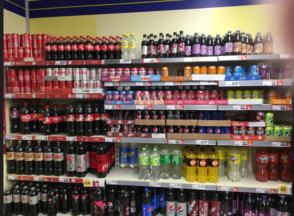
Figure 1 – The drinks section of a local shop. 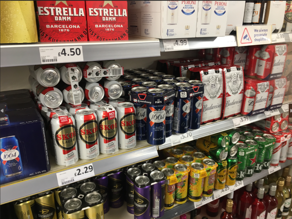
Figure 2 – Beer can packaging designs 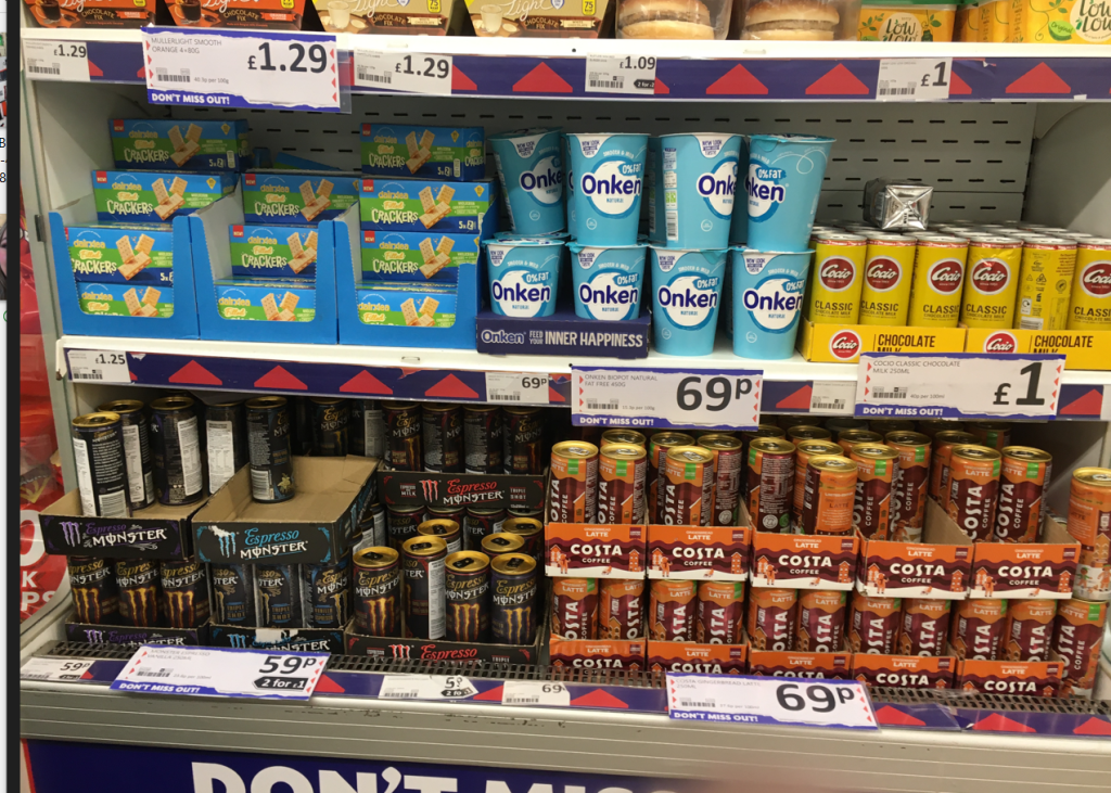
Figure 3 – Monster & Costa coffee packaging designs 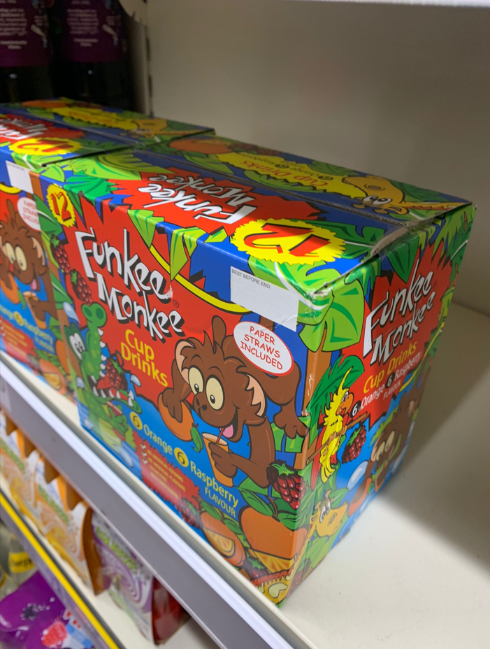
Figure 4 – Juice drink box design 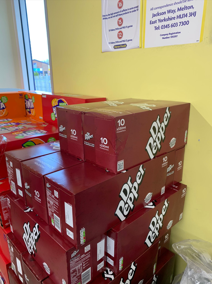
Figure 5 – Dr Pepper 10 pack in a cardboard box 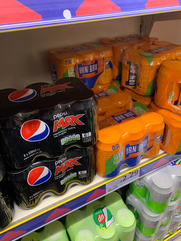
Figure 6 – Pepsi Max & Irn Bru soft drinks
For the brand packaging most companies have now used different alternatives for packaging. For example, instead of plastic packaging being used better alternatives like cardboard have been used to package multipack cans. They are packed in a durable material to allow transport & storage so its less likely to break.
After figuring out a logo for my energy drink & research I needed to come up with a packaging design to go along with it. I wanted to go with the battery can energy drink concept. I went with some sketches and I have created some variations to finalise the energy drink. Here is my sketched idea of what’s going to be an energy drink for seniors. I have taken inspiration from battery cells. I have chosen this design as the design is simple and easy whilst the energy drink can is practical. I believe that simplicity is a good way to create a design. For the design I picked a battery design that everyone is familiar with. batteries have been used for many decades to power sources & still are used to this day.
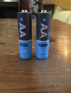
Figure 7 – I have based my design on batteries 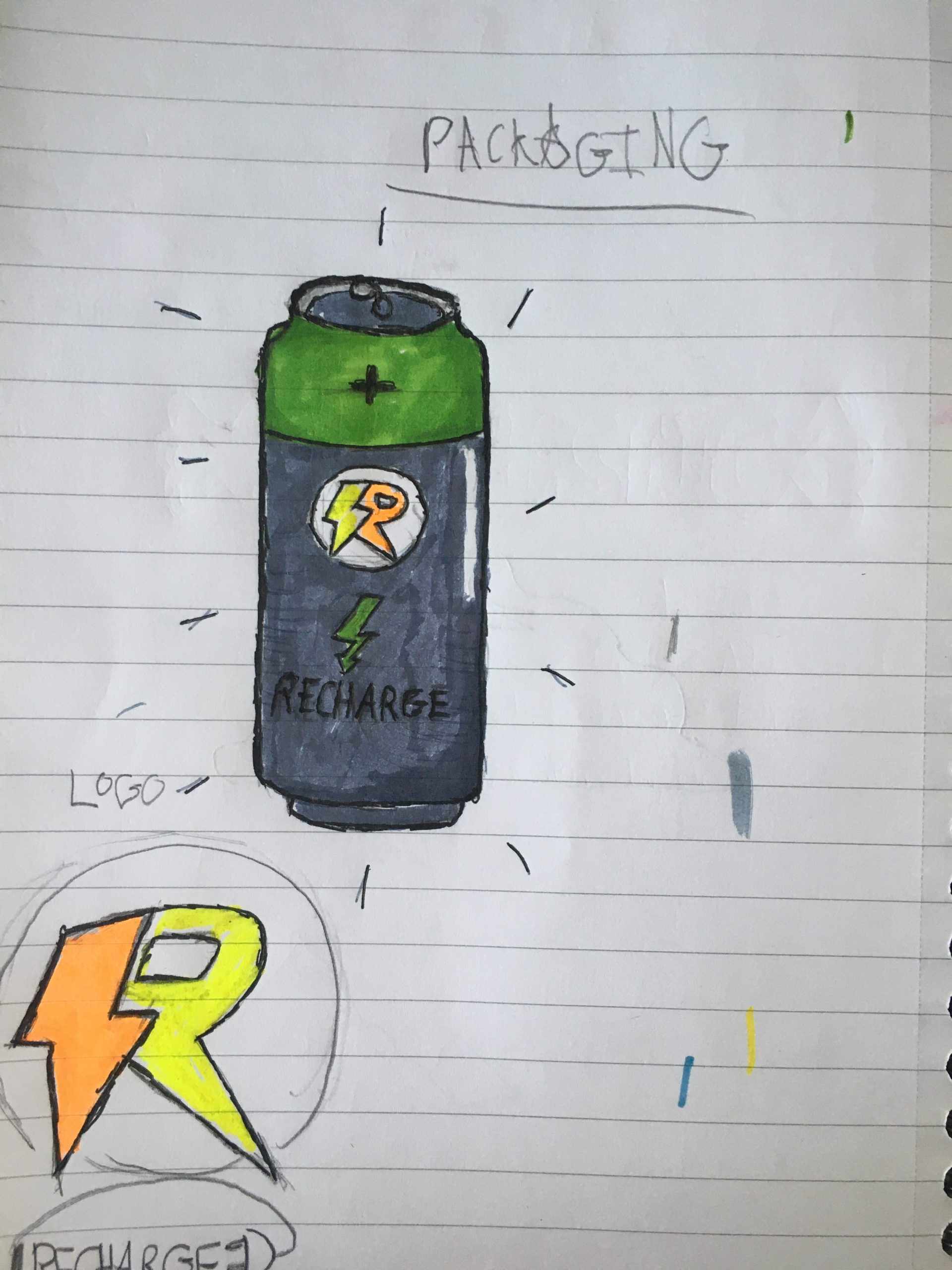
Figure 8 – Recharge energy drink packaging concept sketch. 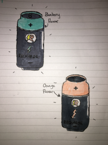
Figure 9 – I experimented with different variations of flavour concepts.
Colour Scheme
For the colour scheme I have picked colours that are colourful however I didn’t want it to look too bright as it would look very modernised. I wanted to create different flavours so I have created a different colour for each flavour. I wanted to go with the idea of keeping the base of the can grey except only the top colour will have colour variation so the buyer can tell it is from the same brand but they can easily distinguish which flavours there are.
Packaging design Illustrator
After designing my early concept I now need to design my ideas on Illustrator to give me a rough idea on how it is going to appear on Substance Software. It is important I include all details such as:
- The ‘Best before’ dates
- The ingredients
- Any necessary warnings
- Net quantity information
- Storage conditions
- The name of food
- The lot number or use by date
- The place of origin if needed
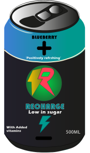
Figure 10 – My Illustrator Recharge drink, front of the can. 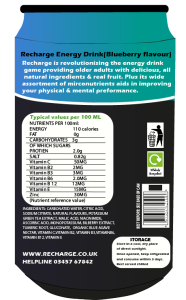
Figure 11 – Illustrator Recharge drink, back of the design. 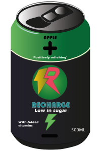
Figure 12 – Apple flavour, front of the can 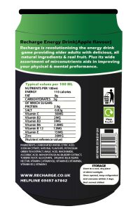
Figure 13 – Apple flavour, back of the can 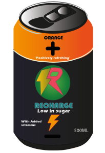
Figure 14 – Orange flavour, front of can 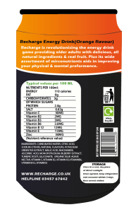
Figure 15 – Orange flavour, back of can 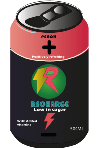
Figure 16 – Peach flavour, front of can 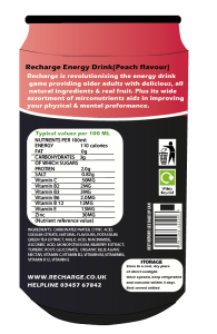
Figure 17 – Peach flavour, back of can 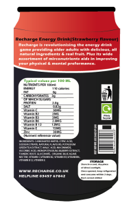
Figure 18 – Strawberry flavour, back of can 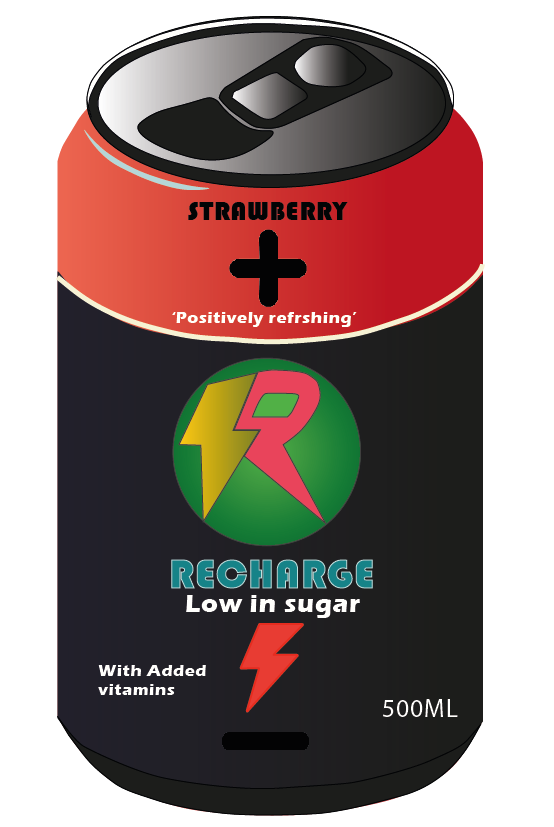
Figure 19 – Strawberry flavour, front of can
Packaging container
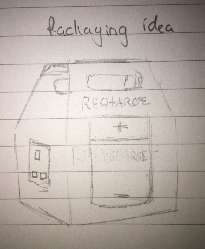
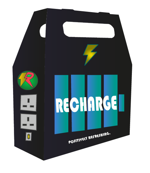
After creating my design idea on Illustrator for Recharge I need to create packaging to store the cans. With the research I have done earlier of how many soda/energy drinks are packaged it is important to make my design eye catching yet practical. I went with my packaging being in the theme of a battery pack as it would go with theme of my energy drink.
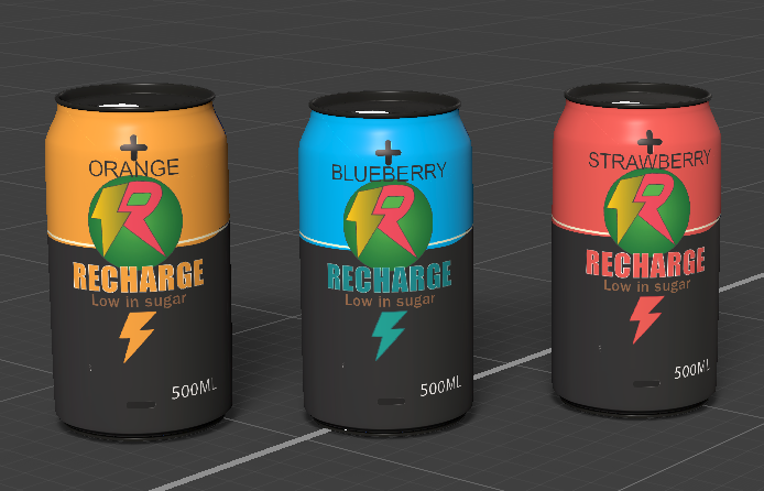
3D Render
References:
Quote – Packaging Innovation. (2014). ‘Design is intelligence made visible’ – the best packaging quotes. [online] Available at: https://www.packaginginnovation.com/packaging-design/packaging-quotes-design-intelligence-made-visible/ [Accessed 10 Apr. 2023].
